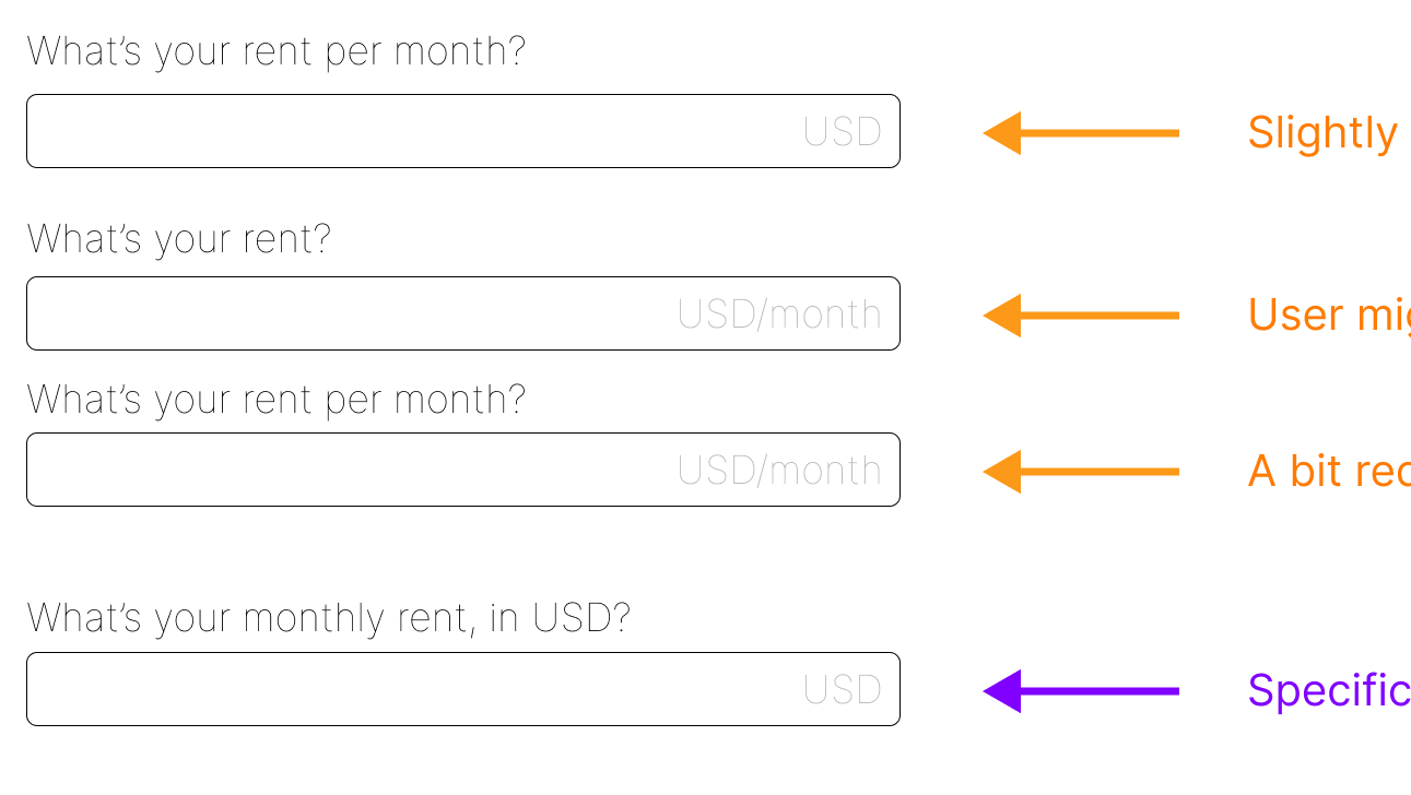
Slight variations in how you display text and phrase something can make all the difference when it comes to tone and even clarity. Conversational tones are more common for friendly, upbeat apps like Zest.
Example 1: Writing gamification into your app
Before
After
It was clear that this was a reward system, but it wasn't clear HOW to get the rewards.
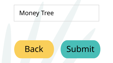
Title case isn't as conversational
Title case isn't as conversational
The bold black color and rigid font didn't work with the light-hearted, upbeat tone of the cafe.
We've included an explanation for how to get a "punch" on the card. We also switched from Title Case to Sentence case and created a more conversational, instructional tone.
By using Sentence case instead of Title Case, the instructional text immediately reads like a regular piece of dialogue instead of like the heading of a manual. It's subliminal, but effective.
Example 2: "Success" messaging and next steps
Before
After
Here, the conversation is less friendly. It sacrifices tone for the sake of brevity and there isn't a lot of instruction for what happens next.
The new approach is much more helpful and helps the customer understand that the cafe appreciates their business. It also explains more about the loyalty card and why it's beneficial.
Example 3: Information architecture and how it impacts your marketing strategy
Before
After
Before, the item name was lost on the screen. There wasn't enough space or hierarchy and button styles were conflicting with one another.
The new version is much clearer, with an H1 that dynamically changes, depending on the item that has bee selected. We've also updated the colors for Zest, bringing a brighter vibe to the app.


